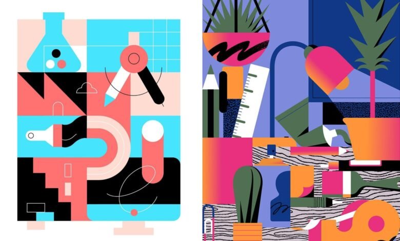
Ugly. Cluttered. Loud. Irresistible.
You know that packaging design you hate? The one with clashing colors, too many fonts, maybe even a cartoonish mascot that looks straight out of an old arcade cabinet? Guess what — it’s flying off shelves. Welcome to the era of bold maximalism — where visual overload isn’t a mistake, it’s the strategy.
It’s loud, proud, chaotic, and — let’s be honest — kind of addictive.
And no, this isn’t just a TikTok trend. It’s shifting how brands approach everything from custom label printing to product photography.
Because the truth is: breaking design rules gets attention. And in a world where attention is currency, that’s a big deal.
Why This Works (Even When It Looks Wrong)
Let’s rewind. For the last decade, branding’s golden child was minimalism: clean fonts, monochrome palettes, and packaging so restrained it practically whispered. That worked when consumers were still intrigued by simplicity.
But now? We’ve been oversaturated. Everyone’s using the same sans-serif fonts. Every DTC brand feels like it came from the same beige Pinterest board. And so, consumers started tuning it all out.
Enter the brands saying:
“What if we made something you can’t ignore?”
Maximalism works because it:
- Taps into emotion — Bright colors and eclectic elements stimulate curiosity and joy.
- Feels human — Messy and expressive reads more authentic than hyper-polished.
- Stands out — On a shelf or feed full of neutrals, chaos is eye-catching.
This isn’t thoughtless design. It’s strategic excess — crafted chaos meant to jolt the senses and spark connection.
Real Brands Breaking the Mold
- Omsom: Asian sauce brand with unapologetically loud packaging, wild typography, and bold language. It’s not trying to look safe. It’s trying to say “We belong on your table.”
- Liquid Death: A water brand that leans into heavy metal aesthetics and anti-corporate messaging. It’s weird. It’s brash. It’s unforgettable.
- Starface: Acne patches in neon yellow packaging with a literal smiley face. It looks like a toy, not a skincare product — and Gen Z eats it up.
These brands didn’t just bend the rules. They rewrote them. And they’re reaping the rewards.
Maximalist Doesn’t Mean Messy (Unless You Want It To)
One of the biggest misconceptions is that maximalist packaging = unprofessional.
Not true.
You can go wild visually while staying buttoned-up technically. For example:
- Custom label printing allows you to explore unique shapes, foil effects, textured materials, or even interactive QR codes — without compromising brand quality.
- Using custom roll labels makes even the busiest designs efficient to apply at scale. Just because it looks handmade doesn’t mean it has to be.
- And for smaller brands or creatives who want to experiment? There are tons of free design resources out there — from vibrant vector packs to retro display fonts — so you can prototype bold ideas before committing to a print run.
You can be loud and smart. That’s the magic formula.
What This Means for Designers and Entrepreneurs
If you’re a designer, it’s time to start asking clients tougher questions:
- Are you holding back just to look “professional”?
- Is your brand’s story being muffled by overly safe design?
- What would your packaging look like if you weren’t afraid of standing out?
And if you’re a founder, this might be the moment to give your packaging a pulse.
Try this thought exercise:
- Open Canva or Illustrator.
- Take your product and mock it up with colors, patterns, or fonts you think are too much.
- Then ask someone younger than you (ideally Gen Z) what they think.
You may be surprised. What feels “too much” to you may feel “finally interesting” to them.
Packaging That Feels Like a Personality
Ultimately, the rise of this rule-breaking trend is about more than just visuals. It’s about voice.
People buy from brands they connect with. Brands that feel bold, relatable, and real. And in 2025, real doesn’t always mean pretty.
It means personality. Texture. Story. A label that feels like it has a pulse.
Final Takeaway: You’re Not Just Competing on Shelf — You’re Competing for Memory
Your product will be one of hundreds in a store, or one of thousands in someone’s Instagram feed. The brands that break through are the ones that:
- Break design conventions
- Speak with confidence
- Aren’t afraid to be polarizing
So here’s your permission:
Make your packaging louder. Lean into color. Say the thing. Use that retro illustration. Choose the clashing font. Build something that looks like it shouldn’t work — and then make it sing.
Your customers don’t need another quiet brand.
They need one they’ll remember.